Puppertino with React, Vue, Svelte and Astro
Puppertino is plain CSS with optional vanilla scripts, so it needs no wrapper for any framework. Four short recipes: the import, dark mode, and which helpers to call after your components mount.
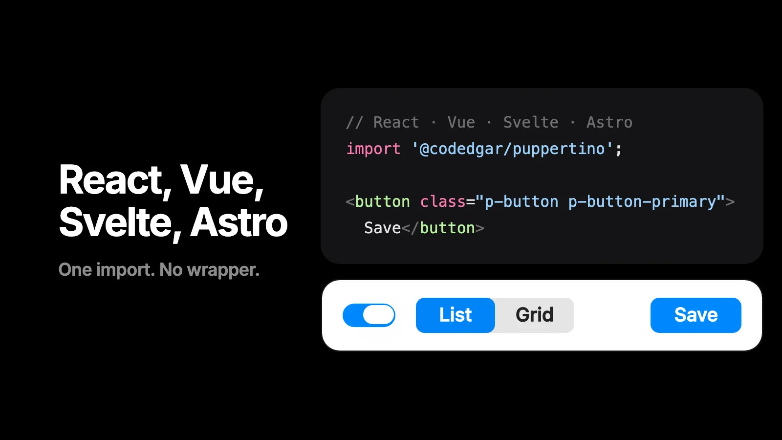
Puppertino has no framework package, and that is the point. It is a stylesheet and a handful of optional scripts, so it drops into any stack the same way: import the CSS once, write the markup from the docs, and call a helper after the markup exists. These are the four stacks people ask about, with the two things each one actually needs.
The rules that apply everywhere
Import colors first. Components read their colors from colors.css. The full bundle already orders it; with per-component imports, put it at the top.
import '@codedgar/puppertino';                 // everything
// or
import '@codedgar/puppertino/colors';
import '@codedgar/puppertino/typography';
import '@codedgar/puppertino/buttons';
import '@codedgar/puppertino/forms';
Dark mode is a class on the body. p-auto-dark-mode follows the system. For a manual toggle, load the dark mode manager and call it; it stores the choice and syncs across tabs.
import '@codedgar/puppertino/js/darkmode_manager.js';
puppertinoThemeMan.init({ autoDetect: true });
// later, from a button:
puppertinoThemeMan.toggle();
Helpers come in two kinds. Modals, menus, popovers and tabs listen on the document, so one import covers markup that mounts at any time. Tab bars, sliders and the two glass scripts scan the page once on load, and expose a call for markup that arrives later.
| Helper | After mounting new markup |
|---|---|
modals.js, menus.js, popovers.js, tabs.js | Nothing. They delegate from the document. |
tab_bar.js | PuppertinoTabBar.init(root) |
sliders.js | PuppertinoSliders.enhance(root) |
liquid_glass.js | PuppertinoLiquidGlass.enhance(root) |
glass.js | PuppertinoGlass.enhance(root), and PuppertinoGlass.refresh() when the content behind the glass changes |
The scripts set globals rather than exporting modules, so import them for their side effects and call the global.
React
// main.jsx
import '@codedgar/puppertino';
import '@codedgar/puppertino/js/darkmode_manager.js';
import '@codedgar/puppertino/js/liquid_glass.js';

puppertinoThemeMan.init({ autoDetect: true });
// Settings.jsx
import { useEffect, useRef, useState } from 'react';
export function Settings() {
const [sync, setSync] = useState(true);
const root = useRef(null);
useEffect(() => {
PuppertinoLiquidGlass.enhance(root.current);
}, []);
return (
<form className="p-form" ref={root}>
<label className="p-form-row">
<span className="p-form-label">Name</span>
<input className="p-field" type="text" defaultValue="Rex" />
</label>
<div className="p-form-row">
<span className="p-form-label">Sync</span>
<label className="p-switch" aria-label="Sync">
<input type="checkbox" checked={sync} onChange={(e) => setSync(e.target.checked)} />
<span />
</label>
</div>
<button className="p-button p-button-primary" type="submit">Save</button>
</form>
);
}The switch is a controlled checkbox like any other. className instead of class, and that is the whole translation.
Vue
// main.js
import '@codedgar/puppertino';
import '@codedgar/puppertino/js/darkmode_manager.js';
puppertinoThemeMan.init({ autoDetect: true });<script setup>
import { onMounted, ref } from 'vue';
import '@codedgar/puppertino/js/tab_bar.js';
const sync = ref(true);
const bar = ref(null);
onMounted(() => PuppertinoTabBar.init(bar.value));
</script>
<template>
<label class="p-switch" aria-label="Sync">
<input type="checkbox" v-model="sync" />
<span></span>
</label>
<nav class="p-tab-bar p-tab-bar-fixed" ref="bar" aria-label="Sections">
<a class="p-tab-bar__tab" href="/" aria-current="page"><i class="ph-bold ph-house"></i><span>Home</span></a>
<a class="p-tab-bar__tab" href="/search/"><i class="ph-bold ph-magnifying-glass"></i><span>Search</span></a>
</nav>
</template>v-model on the checkbox, ref on anything a helper needs to see after mount.
Svelte
<script>
  import { onMount } from 'svelte';
  import '@codedgar/puppertino';
  import '@codedgar/puppertino/js/sliders.js';
  import '@codedgar/puppertino/js/liquid_glass.js';

  let volume = 65;
  let root;
  onMount(() => {
    PuppertinoSliders.enhance(root);
    PuppertinoLiquidGlass.enhance(root);
  });
</script>

<div bind:this={root}>
  <input type="range" class="p-slider p-slider-touch" min="0" max="100" bind:value={volume} aria-label="Volume" />
</div>
bind:value keeps the number, the slider script keeps the fill and the lens.
Astro
Astro renders HTML, so the markup is the markup. Import the stylesheet in the layout and load scripts as modules; the glass scripts take a ?url import so they ship as files.
---
// src/layouts/Base.astro
import '@codedgar/puppertino';
import liquidGlass from '@codedgar/puppertino/js/liquid_glass.js?url';
---
<html lang="en">
  <body class="p-type p-auto-dark-mode">
    <slot />
    <script type="module" src={liquidGlass}></script>
  </body>
</html>
With view transitions on, re-run the scanning helpers after each navigation.
<script>
  document.addEventListener('astro:page-load', () => {
    PuppertinoLiquidGlass.enhance(document);
    PuppertinoTabBar.init(document);
  });
</script>
This site is Astro, and the live demos in these posts are the same markup with the same scripts.
The CDN, for any of them
Every stack above also works with no bundler at all.
<link rel="stylesheet" href="https://cdn.jsdelivr.net/npm/@codedgar/puppertino@2.0.0/dist/css/puppertino.min.css">
<script src="https://cdn.jsdelivr.net/npm/@codedgar/puppertino@2.0.0/src/js/liquid_glass.js" type="module"></script>
The only official package is @codedgar/puppertino. The unscoped puppertino on npm is not this project.
Questions
Does Puppertino work with React?
Yes. Import the stylesheet once at the app root and use the classes in JSX. There is no React package because none is needed. The optional scripts are plain globals; call their enhance function from useEffect for markup that mounts later.
Is there a Puppertino component library for Vue or Svelte?
No, and there does not need to be one. Puppertino is CSS over native elements, so a Vue or Svelte component is the markup from the docs with your state bound to it.
Do the JavaScript helpers break with client-side rendering?
No. Modals, menus and popovers listen on the document, so they see markup added at any time. Tab bars, sliders and the glass lenses scan once on load; for parts that mount later, call their enhance or init function.
Can I use Puppertino with Tailwind?
Yes. Puppertino's classes are all prefixed p-, so they never collide with utilities. Load Puppertino first and use utilities for layout around its components.
How do I tree-shake it?
Import only the files you use: @codedgar/puppertino/colors first, then @codedgar/puppertino/buttons, forms and so on. Each component is its own stylesheet.
Related posts
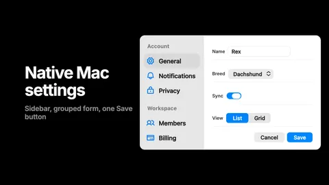
Build a settings page that feels native on a Mac, in HTML and CSS
A sidebar, a grouped form, a switch, a segmented control and one Save button, in about sixty lines of plain HTML with Puppertino. The result reads as a Mac preferences pane without pretending to be one, and it works in dark mode and with a keyboard.