Apple system colors in CSS, with the hex values
The thirteen macOS 27 and iOS 27 accents, the text levels, fills, backgrounds, grays and separators, as hex and rgba for light and dark, and as CSS custom properties that flip on their own. Copy the table or load the stylesheet.
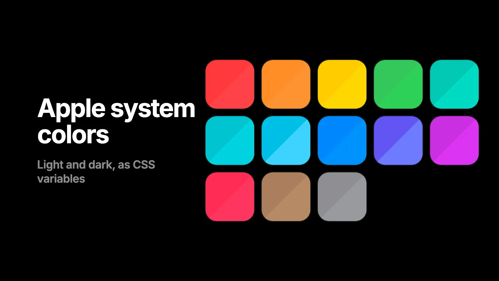
Apple’s colors are pairs, not values. Each one has a light appearance and a dark appearance, and the dark one is a little brighter on purpose. Every table below gives both, with the Puppertino custom property that holds them. Load one stylesheet and use the property; the pair flips with the system.
<link rel="stylesheet" href="https://cdn.jsdelivr.net/npm/@codedgar/puppertino@2.0.0/dist/css/colors.css">.badge { background: var(--p-sys-blue); color: #fff; }Put p-auto-dark-mode on the body to follow the system, or p-dark-mode to force dark.
The thirteen accents
| Color | Variable | Light | Dark |
|---|---|---|---|
| Red | --p-sys-red | #FF383C | #FF4245 |
| Orange | --p-sys-orange | #FF8D28 | #FF9230 |
| Yellow | --p-sys-yellow | #FFCC00 | #FFD600 |
| Green | --p-sys-green | #34C759 | #30D158 |
| Mint | --p-sys-mint | #00C8B3 | #00DAC3 |
| Teal | --p-sys-teal | #00C3D0 | #00D2E0 |
| Cyan | --p-sys-cyan | #00C0E8 | #3CD3FE |
| Blue | --p-sys-blue | #0088FF | #0091FF |
| Indigo | --p-sys-indigo | #6155F5 | #6D7CFF |
| Purple | --p-sys-purple | #CB30E0 | #DB34F2 |
| Pink | --p-sys-pink | #FF2D55 | #FF375F |
| Brown | --p-sys-brown | #AC7F5E | #B78A66 |
| Gray | --p-sys-gray | #8E8E93 | #98989F |
Click a swatch to copy its variable. Each color also has a class, p-sys-green for example, which retints any Puppertino control it sits on. A green switch is p-switch p-sys-green.
The control accent
Blue is also the accent for every tinted control: filled buttons, switches, sliders, progress bars and the selected segment. It is the same blue as links and selection.
| Token | Light | Dark | What it is |
|---|---|---|---|
--p-control-accent | #0088FF | #0091FF | The default control fill |
--p-control-accent-text | #0078F0 | #0091FF | The accent as text on a material |
--p-focus-ring | rgba(0,136,255,0.5), 3.5px outside plus 1px inside | Same at rgba(0,145,255,0.5) | Keyboard focus on fields and controls |
A browser cannot read the accent a person chose in System Settings. Apple’s own apps use blue when no accent is set, so default to blue and let a class change it per control.
.my-field:focus-visible {
  outline: none;
  box-shadow: var(--p-focus-ring);
}
Text levels
Six levels. Primary is not pure black: Apple uses 85 percent so the surface shows through, which matters over glass.
| Level | Variable | Light | Dark |
|---|---|---|---|
| Primary | --p-text-primary | rgba(0,0,0,0.85) | rgba(255,255,255,0.85) |
| Secondary | --p-text-secondary | rgba(0,0,0,0.50) | rgba(255,255,255,0.55) |
| Tertiary | --p-text-tertiary | rgba(0,0,0,0.25) | rgba(255,255,255,0.25) |
| Quaternary | --p-text-quaternary | rgba(0,0,0,0.10) | rgba(255,255,255,0.10) |
| Quinary | --p-text-quinary | rgba(0,0,0,0.05) | rgba(255,255,255,0.05) |
| Seximal | --p-text-seximal | rgba(0,0,0,0.03) | rgba(255,255,255,0.03) |
Each has a class: p-text-primary, p-text-secondary and so on.
Fills
Five tiers of quiet tint for buttons, segmented backgrounds and search fields. They are black or white at low opacity, so they composite over materials.
| Tier | Variable | Light | Dark |
|---|---|---|---|
| Primary | --p-fill-primary | rgba(0,0,0,0.10) | rgba(255,255,255,0.10) |
| Secondary | --p-fill-secondary | rgba(0,0,0,0.08) | rgba(255,255,255,0.08) |
| Tertiary | --p-fill-tertiary | rgba(0,0,0,0.05) | rgba(255,255,255,0.05) |
| Quaternary | --p-fill-quaternary | rgba(0,0,0,0.03) | rgba(255,255,255,0.03) |
| Quinary | --p-fill-quinary | rgba(0,0,0,0.02) | rgba(255,255,255,0.02) |
Backgrounds
Three tiers for layered surfaces, three grouped tiers for list-style content, and elevated versions for sheets and popovers. In dark mode an elevated surface gets lighter, not darker. That is where the depth comes from.
| Tier | Variable | Light | Dark |
|---|---|---|---|
| Primary | --p-bg-primary | #FFFFFF | #000000 |
| Secondary | --p-bg-secondary | #F2F2F7 | #1C1C1E |
| Tertiary | --p-bg-tertiary | #FFFFFF | #2C2C2E |
| Grouped primary | --p-bg-grouped-primary | #F2F2F7 | #000000 |
| Grouped secondary | --p-bg-grouped-secondary | #FFFFFF | #1C1C1E |
| Grouped tertiary | --p-bg-grouped-tertiary | #F2F2F7 | #2C2C2E |
| Elevated primary | --p-bg-elevated-primary | #FFFFFF | #1C1C1E |
| Elevated secondary | --p-bg-elevated-secondary | #F2F2F7 | #2C2C2E |
| Elevated tertiary | --p-bg-elevated-tertiary | #FFFFFF | #3A3A3C |
Use the grouped tiers for settings screens and inset lists.
Separators
| Token | Light | Dark |
|---|---|---|
--p-separator | rgba(60,60,67,0.29) | rgba(84,84,88,0.60) |
--p-separator-opaque | #C6C6C8 | #38383A |
Draw hairlines with an inset box shadow of half a pixel, so they stay one device pixel on a retina screen.
.row { box-shadow: inset 0 -0.5px 0 var(--p-separator); }iOS grays and labels
Touch components use the iOS set, which differs in the grays, labels, fills and separator. Gray stays #8E8E93 in dark mode on iOS.
| Token | Light | Dark |
|---|---|---|
--p-ios-gray | #8E8E93 | #8E8E93 |
--p-ios-gray-2 | #AEAEB2 | #636366 |
--p-ios-gray-3 | #C7C7CC | #48484A |
--p-ios-gray-4 | #D1D1D6 | #3A3A3C |
--p-ios-gray-5 | #E5E5EA | #2C2C2E |
--p-ios-gray-6 | #F2F2F7 | #1C1C1E |
--p-ios-label | #000000 | #FFFFFF |
--p-ios-label-secondary | rgba(60,60,67,0.60) | rgba(235,235,245,0.70) |
--p-ios-label-tertiary | rgba(60,60,67,0.30) | rgba(235,235,245,0.30) |
--p-ios-label-quaternary | rgba(60,60,67,0.18) | rgba(235,235,245,0.16) |
--p-ios-fill | rgba(120,120,128,0.20) | rgba(120,120,128,0.36) |
--p-ios-fill-secondary | rgba(120,120,128,0.16) | rgba(120,120,128,0.32) |
--p-ios-fill-tertiary | rgba(118,118,128,0.12) | rgba(118,118,128,0.24) |
--p-ios-fill-quaternary | rgba(116,116,128,0.08) | rgba(118,118,128,0.18) |
--p-ios-separator | rgba(0,0,0,0.12) | rgba(255,255,255,0.17) |
Three rules that keep it looking right
- Use the pair. A light value on a dark background looks dull, and a dark value on white looks garish. The token does this for you; a pasted hex does not.
- Color is never the only signal. Pair red with the word Delete, green with a checkmark. Apple does, and so do the people who cannot tell them apart.
- Red is for destruction. One accent for brand or selection, red for the action that cannot be undone, and nothing else gets red.
The full system, with the vibrant set, the unofficial shades and the accessibility behavior, is on the Colors page.
Questions
What is the hex for Apple's system blue?
On macOS 27 and iOS 27 it is #0088FF in light mode and #0091FF in dark mode. Puppertino exposes it as --p-sys-blue, which flips between the two with the appearance.
How do I use the macOS accent color in CSS?
The browser does not expose the user's chosen accent. Use the system blue as the default accent, which is what Apple's own apps do when no accent is set, and let people pick another with a class such as p-sys-purple on the control.
Why are the dark mode colors brighter?
Apple raises saturation and lightness slightly in dark mode so an accent keeps the same visual weight against black. Using the light value on a dark background looks dull. Use the pair, not one value.
Are these the same as the older #007AFF values?
No. #007AFF is the blue Apple used from iOS 7 until the Liquid Glass redesign. macOS 27 and iOS 27 use #0088FF light and #0091FF dark, and the rest of the set shifted with it. Puppertino ships the current values.
Can I use these colors without the whole framework?
Yes. Load only colors.css, from the CDN or with import '@codedgar/puppertino/colors', and every token in this post is defined, with light and dark handled by p-auto-dark-mode.
Related posts
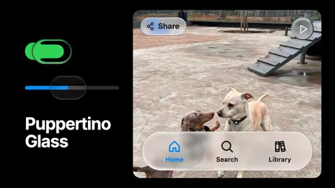
Puppertino Glass: How we implemented liquid glass for UI components and surfaces
Apple's Liquid Glass has no native version on the web. Puppertino ships two: a faux lens for switches and sliders that works everywhere with no library, and real-time refraction for bars, buttons and panels in Safari, Chrome, Firefox and Edge. Here is how each one is built and when to use which.
How to get an AI agent to design like Apple on the web
Claude Code, Codex and Cursor can build macOS and iOS style interfaces on the web that follow Apple's Human Interface Guidelines. The Puppertino skill gives them the rules and the markup, in one install.
Puppertino 2.0, Dachshund: what changed
Puppertino 2.0 (Dachshund, October 2026) rebuilds the framework on the macOS 27 and iOS 27 design. Here is what is new, what the versions map to, and how to upgrade from 1.x without touching your markup.