Build a settings page that feels native on a Mac, in HTML and CSS
A sidebar, a grouped form, a switch, a segmented control and one Save button, in about sixty lines of plain HTML with Puppertino. The result reads as a Mac preferences pane without pretending to be one, and it works in dark mode and with a keyboard.
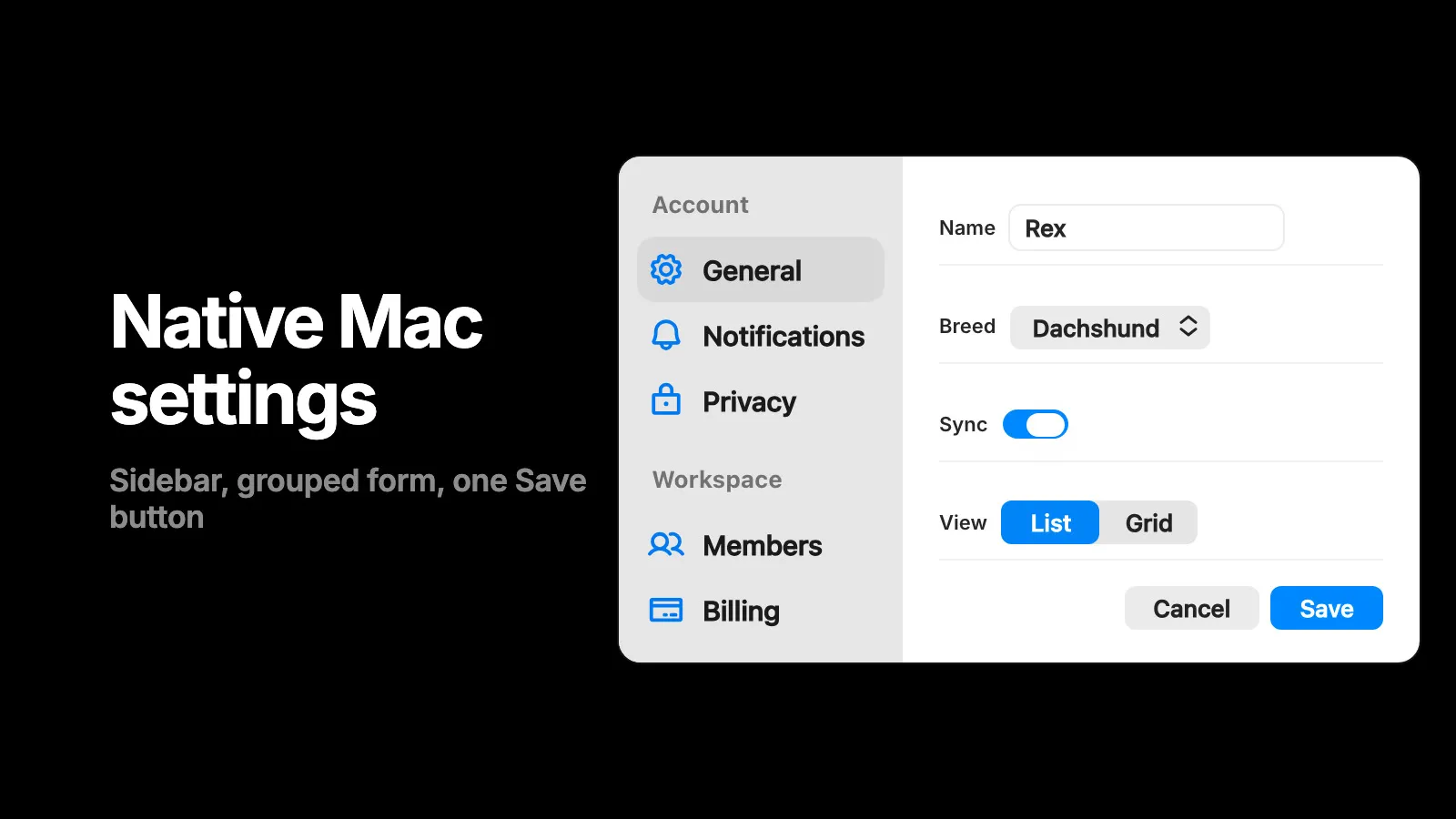
Most “macOS style” settings pages on the web are a card with rounded corners and a blue button. A Mac preferences pane is a specific shape: a sidebar of sections on the left, one pane on the right, labels on the left of each row, controls on the right, and one button that commits. This guide builds that shape with real Puppertino markup, in plain HTML.
Here is the finished pane. Tab through it, flip the switch, change the view.
Start with one stylesheet
No build step. One link in the head and a class on the body.
<!doctype html>
<html lang="en">
<head>
  <meta charset="utf-8">
  <meta name="viewport" content="width=device-width, initial-scale=1">
  <title>Settings</title>
  <link rel="stylesheet" href="https://cdn.jsdelivr.net/npm/@codedgar/puppertino@2.0.0/dist/css/puppertino.min.css">
</head>
<body class="p-type p-auto-dark-mode">
  …
</body>
</html>
p-type sets the macOS text styles on everything inside, 13px body and all. p-auto-dark-mode follows the system appearance, so the page is dark when the Mac is dark without any script.
The sidebar
A Mac sidebar is a list of rows with an optional icon, grouped under small uppercase headers. One row is selected.
<nav class="p-sidebar" aria-label="Settings sections">
  <div class="p-sidebar-header">Account</div>
  <div class="p-sidebar-row p-selected"><span class="p-sidebar-icon"><i class="ph-bold ph-gear"></i></span> General</div>
  <div class="p-sidebar-row"><span class="p-sidebar-icon"><i class="ph-bold ph-bell"></i></span> Notifications</div>
  <div class="p-sidebar-row"><span class="p-sidebar-icon"><i class="ph-bold ph-lock"></i></span> Privacy</div>
</nav>
p-selected marks the current section. The icon slot takes any icon font or an inline SVG; the demo uses Phosphor. Use p-sidebar-row as links when each section is its own page, or as buttons when you swap panes in place.
The form
The pane is a p-form. Each p-form-row puts a label on the left and a control on the right, aligned to the same column, which is what makes it read as a preferences pane rather than a web form.
<form class="p-form">
  <label class="p-form-row">
    <span class="p-form-label">Name</span>
    <input class="p-field" type="text" value="Rex">
  </label>

  <label class="p-form-row">
    <span class="p-form-label">Breed</span>
    <div class="p-select">
      <select aria-label="Breed">
        <option>Dachshund</option>
        <option>Saluki</option>
      </select>
    </div>
  </label>

  <div class="p-form-row">
    <span class="p-form-label">Sync</span>
    <label class="p-switch" aria-label="Sync"><input type="checkbox" checked><span></span></label>
  </div>

  <div class="p-form-row">
    <span class="p-form-label">View</span>
    <div class="p-segmented" role="group" aria-label="View">
      <label class="p-segment"><input type="radio" name="view" checked><span>List</span></label>
      <label class="p-segment"><input type="radio" name="view"><span>Grid</span></label>
    </div>
  </div>

  <button class="p-button" type="button">Cancel</button>
  <button class="p-button p-button-primary" type="submit">Save</button>
</form>
Three things that matter here.
- The switch is a checkbox.
p-switchwraps a real<input type="checkbox">, so it submits with the form, toggles with Space, and reads as a switch to a screen reader. Nothing to wire. - The segmented control is a radio group.
p-segmentedholdsp-segmentlabels around real radios, so arrow keys move the selection and the form gets one value. - One primary button.
p-button-primaryis the filled action that also answers the Return key. Everything else is a plainp-button. If you need a delete, it isp-button-destructive, and it never sits next to Save.
Put them side by side
<div class="pane">
  <nav class="p-sidebar">…</nav>
  <form class="p-form">…</form>
</div>
.pane {
display: flex;
background: var(--p-bg-primary);
border-radius: 12px;
overflow: hidden;
}
.pane .p-sidebar { width: 200px; flex: none; }
.pane .p-form { flex: 1; padding: 20px 24px; display: grid; gap: 12px; }That is the whole layout. The sidebar keeps its own material and selected-row tint. The pane is the primary background token, so it is white on a light Mac and near black on a dark one.
When it is the whole window
A companion app that opens its settings in its own window gets the window chrome too: a title bar with traffic lights, then the pane below it.
<div class="p-window">
  <div class="p-window-titlebar p-window-titlebar-unified">
    <div class="p-window-titlebar-row">
      <div class="p-traffic-lights">
        <button class="p-traffic-light p-traffic-light-close" aria-label="Close"></button>
        <button class="p-traffic-light p-traffic-light-min" aria-label="Minimize"></button>
        <button class="p-traffic-light p-traffic-light-zoom" aria-label="Zoom"></button>
      </div>
      <div class="p-window-titles"><span class="p-window-title">Settings</span></div>
    </div>
  </div>
  <div class="pane">…</div>
</div>
Only do this when the page is the window. Inside an Electron or Tauri app the OS already draws the title bar, so start at the pane.
Check before you ship
- Press Tab from the first field to the Save button. Every stop shows a focus ring. Puppertino never removes one.
- Switch the Mac to dark mode. Nothing should need a second look, because every color came from a token.
- Turn on Increase Contrast in System Settings. Borders and fills get stronger on their own.
- Leave the sidebar rows at their default height. Mac rows are compact on purpose; the 44px rule is for touch.
The agent version of this guide is the Puppertino skill, which carries this exact markup and the checklist.
Questions
How do I make a settings page look like macOS in HTML and CSS?
Load Puppertino's stylesheet, put a p-sidebar beside a p-form, and use p-field, p-select, p-switch and p-segmented for the controls. Every value in this guide is real markup you can copy, and dark mode and keyboard focus come with the classes.
Does this need JavaScript?
No. The sidebar, the form, the switch and the segmented control are CSS over native elements. The switch is a checkbox and the segmented control is a radio group, so they submit with the form.
Can I use it in an Electron or Tauri app?
Yes. It is a normal web page. Electron and Tauri render it in a system web view, and the sidebar plus form shape is what a Mac companion app's settings window usually is.
Does it work in dark mode?
Yes. Put p-auto-dark-mode on the body and every token flips with the system appearance. Nothing in this guide hard-codes a color.
Is this a copy of System Settings?
No. It uses the same components Apple uses for a settings window, so your product's settings feel at home on a Mac. It is your page, not a replica of Apple's app.
Related posts
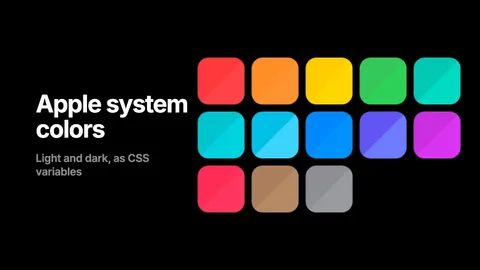
Apple system colors in CSS, with the hex values
The thirteen macOS 27 and iOS 27 accents, the text levels, fills, backgrounds, grays and separators, as hex and rgba for light and dark, and as CSS custom properties that flip on their own. Copy the table or load the stylesheet.
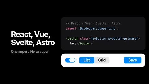
Puppertino with React, Vue, Svelte and Astro
Puppertino is plain CSS with optional vanilla scripts, so it needs no wrapper for any framework. Four short recipes: the import, dark mode, and which helpers to call after your components mount.
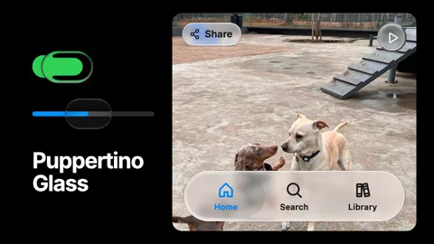
Puppertino Glass: How we implemented liquid glass for UI components and surfaces
Apple's Liquid Glass has no native version on the web. Puppertino ships two: a faux lens for switches and sliders that works everywhere with no library, and real-time refraction for bars, buttons and panels in Safari, Chrome, Firefox and Edge. Here is how each one is built and when to use which.