How to get an AI agent to design like Apple on the web
Claude Code, Codex and Cursor can build macOS and iOS style interfaces on the web that follow Apple's Human Interface Guidelines. The Puppertino skill gives them the rules and the markup, in one install.
Ask an agent for “a web settings page that feels like a Mac app” and you get a guess. Tailwind-gray cards, a 16px body, a blue that is almost Apple’s, no dark mode, no focus rings. The agent has seen a lot of Apple screenshots and none of the rules behind them.
The Puppertino skill gives it the rules and the markup. It ships inside the Puppertino repository, as a plain SKILL.md with two reference files, so the recipes change in the same commit as the framework.
Install
With the skills installer:
npx skills add codedgar/PuppertinoIn Claude Code, as a plugin:
claude plugin marketplace add codedgar/Puppertino
claude plugin install puppertino@puppertino
Or copy skills/puppertino into your skills folder. The Agent skill page has the long version.
What the agent learns
Three things, in the order it needs them.
When to use it. Mac-style or iPhone-style interfaces on the web, Apple-style settings pages, dashboards, Electron and Tauri apps, PWAs, Liquid Glass, Apple system colors, Apple’s type scale, or any project that already loads Puppertino. It also knows what stays out of the output: the Apple logo, Apple trademarks as a product name, SF Pro font files, Apple’s icons and artwork, and any claim of Apple’s endorsement. Ask for a full desktop in a browser tab and it builds one, with a single note that the framework is tuned for products rather than system clones.
The rules. Apple’s text styles with sizes, weights and tracking. Thirteen system accents with their light and dark values. The 4px spacing grid. Corner radii per element. Five material thicknesses. Four shadow levels. Motion timings and the spring curves. The accessibility floor: 4.5:1 contrast, 44px targets, a focus ring that never disappears. All of it condensed in references/hig.md.
The markup. A macOS window with a sidebar and toolbar. A settings form with fields, a select, a switch and a segmented control. Lists and tables. An alert with a destructive action. An iOS screen with a navigation bar, an inset list and a tab bar. Touch buttons and fields. Liquid Glass switches and sliders. Materials. Scoped dark mode. Each one is real Puppertino markup in references/recipes.md, and for anything else the agent fetches llms-full.txt, which lists every class in every stylesheet.
What a settings pane looks like after
This is the kind of markup the agent writes from the recipes, rendered live.
<nav class="p-sidebar" aria-label="Settings sections">
<div class="p-sidebar-row p-selected"><span class="p-sidebar-icon"><i class="ph-bold ph-gear"></i></span> General</div>
<div class="p-sidebar-row"><span class="p-sidebar-icon"><i class="ph-bold ph-bell"></i></span> Notifications</div>
</nav>

<form class="p-form">
<label class="p-form-row"><span class="p-form-label">Name</span><input class="p-field" type="text"></label>
<div class="p-form-row"><span class="p-form-label">Sync</span><label class="p-switch" aria-label="Sync"><input type="checkbox" checked><span></span></label></div>
<div class="p-form-row"><span class="p-form-label">View</span>
  <div class="p-segmented" role="group" aria-label="View">
    <label class="p-segment"><input type="radio" name="view" checked><span>List</span></label>
    <label class="p-segment"><input type="radio" name="view"><span>Grid</span></label>
  </div>
</div>
<button class="p-button p-button-primary" type="submit">Save</button>
</form>
Every color is a --p- token, so the same markup is correct in dark mode. The switch is a checkbox and the segmented control is a radio group, so forms, labels and keyboard navigation work without a script.
Why a skill and not a prompt
A prompt is written once and forgotten. A skill is a file in the repository, versioned with the framework, and loaded only when the task matches its description. When a component changes, the recipe changes in the same commit, and the next agent that loads the skill gets the current markup.
The skill also carries the checks a reviewer would run: one prominent button per view, red only for destructive actions, 44px targets on touch, an opaque fallback under every blur, and nothing of Apple’s in the output.
A prompt to try
Build the account settings page for a Mac companion app. Sidebar on the left with General, Notifications and Privacy. The General pane has name, email, a sync switch and a List or Grid segmented control. One Save button.
The agent picks the desktop set, loads one stylesheet, writes the sidebar, the form and the buttons from the recipes, uses tokens for every color, and checks dark mode and focus before it answers.
Questions
Is there a Claude skill for Apple design on the web?
Yes. The Puppertino skill ships in the Puppertino repository under skills/puppertino. Install it with npx skills add codedgar/Puppertino, or as a Claude Code plugin with claude plugin marketplace add codedgar/Puppertino. It covers macOS 27 and iOS 27, following Apple's Human Interface Guidelines.
Does the skill work with Codex, Cursor or other agents?
Yes. It is a standard SKILL.md in the Agent Skills format with two reference files, so any tool that reads that format can load it. The npx skills installer handles most of them.
Does the agent need Puppertino installed in the project?
The skill adds the stylesheet itself, from the jsDelivr CDN or npm, as the first step of any build. Nothing else is required. The JavaScript helpers are optional and loaded only when a component needs one.
Can the agent make a Finder or a macOS desktop in the browser?
Yes. It builds it and notes once that Puppertino is tuned for products that use Apple's components rather than for system clones. What it never adds is Apple's logo, trademarks, fonts, icons or artwork.
Is the skill or Puppertino affiliated with Apple?
No. Puppertino is an independent open-source project under the MIT license. It follows Apple's public Human Interface Guidelines and is not endorsed by Apple Inc.
Related posts
Apple system colors in CSS, with the hex values
The thirteen macOS 27 and iOS 27 accents, the text levels, fills, backgrounds, grays and separators, as hex and rgba for light and dark, and as CSS custom properties that flip on their own. Copy the table or load the stylesheet.
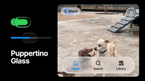
Puppertino Glass: How we implemented liquid glass for UI components and surfaces
Apple's Liquid Glass has no native version on the web. Puppertino ships two: a faux lens for switches and sliders that works everywhere with no library, and real-time refraction for bars, buttons and panels in Safari, Chrome, Firefox and Edge. Here is how each one is built and when to use which.
Puppertino 2.0, Dachshund: what changed
Puppertino 2.0 (Dachshund, October 2026) rebuilds the framework on the macOS 27 and iOS 27 design. Here is what is new, what the versions map to, and how to upgrade from 1.x without touching your markup.