Puppertino 2.0, Dachshund: what changed
Puppertino 2.0 (Dachshund, October 2026) rebuilds the framework on the macOS 27 and iOS 27 design. Here is what is new, what the versions map to, and how to upgrade from 1.x without touching your markup.
Puppertino 2.0 is out. The codename is Dachshund, and it is the first version built for the look Apple shipped with macOS 27 and iOS 27. It adds a full desktop component set, a larger mobile set, Liquid Glass, and new foundations for color, type and materials.
Every class from version 1 still works. Upgrading does not require changes to your markup.
<link rel="stylesheet" href="https://cdn.jsdelivr.net/npm/@codedgar/puppertino@2.0.0/dist/css/puppertino.min.css">npm install @codedgar/puppertino@2.0.0The versions, and which OS each one follows
People search for the OS they know, so here is the map in one place.
| Version | Codename | Year | Follows | Headline |
|---|---|---|---|---|
| 2.0 | Dachshund | 2026 | macOS 27, iOS 27 | Desktop set, Liquid Glass, new foundations |
| 1.x | Siberian | 2024 | The 1.x design | Refreshed components on the 1.x line |
| 1.0 | 2021 | macOS Big Sur era | First stable release, a mobile-first kit | |
| 2019 | First commit: a file of buttons |
The only official npm package is @codedgar/puppertino. The unscoped puppertino package on npm is not maintained by this project.
Foundations
Three foundation files replace their version 1 counterparts. Each 2.0 file includes the old classes alongside the 2.0 tokens, so nothing breaks when you switch.
| Version 1 | Version 2 | What is new |
|---|---|---|
color_palette.css | colors.css | Thirteen system accents, six text levels, five fills, and semantic backgrounds, each with light and dark values |
layout.css | typography.css | Apple’s text styles from Large Title to Caption 2, with weights and tracking |
shadows.css | materials.css | Five material thicknesses, elevation shadows, and Liquid Glass |
A new adaptive.css adds page structure: size classes, split views, containers and readable width.
Colors, fills and text levels are CSS custom properties with the --p- prefix, so a theme can change them in one place. The text styles are classes.
Library
Thirteen system accents, six text levels and five fills, in light and dark.
Edited just now
<h1 class="p-large-title-2 p-emphasized">Library</h1>
<p class="p-body">Thirteen system accents, six text levels and five fills.</p>
<p class="p-footnote-2" style="color: var(--p-text-secondary);">Edited just now</p>
<span style="background: var(--p-sys-blue);"></span>
Desktop components
Version 1 was a mobile kit. Version 2 adds a component set for pointer-driven interfaces that follows macOS conventions, with hover states and compact sizing.
- Buttons, segmented controls, sliders and disclosure controls
- Forms: text fields, selects, steppers, search fields, pop-up and pull-down buttons, combo boxes, checkboxes, radios and switches
- Color wells, image wells and date pickers
- Menus, popovers and tooltips
- Modals, dialogs, sheets and notifications
- Windows, sidebars, toolbars, the menu bar and the Dock
- Lists, tables, progress indicators and scrollbars
<button class="p-button">Cancel</button>
<button class="p-button p-button-colored">Save changes</button>
<label class="p-switch" aria-label="Sync"><input type="checkbox" checked /><span></span></label>
Mobile components
The touch set grows beyond the version 1 buttons, forms, modals, actions and tabs.
- Navigation bars, toolbars and tab bars
- Menus and popovers
- Sidebars
- Lists with swipe actions
- Color pickers and date pickers
- Notifications and empty states
Touch variants live beside their pointer component as a modifier. .p-menu-touch sits next to .p-menu, for example, so one stylesheet covers both platforms.
<button class="p-button p-button-touch p-button-primary" type="button">Save</button>

<nav class="p-tab-bar" aria-label="Sections">
<a class="p-tab-bar__tab" href="/" aria-current="page">
  <i class="ph-bold ph-house"></i><span>Home</span>
</a>
<a class="p-tab-bar__tab" href="/search/">
  <i class="ph-bold ph-magnifying-glass"></i><span>Search</span>
</a>
</nav>
Liquid Glass
Bars and buttons can refract the page behind them. The rendering comes from Glassworks 2.0, which is optional. Without it, every surface keeps its CSS material.
Switches and sliders lift into a lens when pressed. That part needs no extra library. Press and hold a switch below, then drag across it.
<label class="p-switch" aria-label="Wi-Fi">
<input type="checkbox" checked />
<span></span>
</label>
<input type="range" class="p-slider p-slider-touch" min="0" max="100" value="65" aria-label="Volume" />

<script src="src/js/liquid_glass.js"></script>
<script src="src/js/sliders.js"></script>
With Reduce Transparency or Increase Contrast turned on, glass surfaces turn solid. The Materials page covers the faux and real-time versions and when to pick each.
Dark mode
| Class | What it does |
|---|---|
.p-auto-dark-mode | Follows the system appearance |
.p-dark-mode | Forces dark |
.p-light-mode | Pins a region to light inside a dark page |
.p-light-mode arrives with 2.0. Put any of the three on <body>, or on an element to scope it. The two cards below sit in the same page, and each one carries its own appearance.
Light region
p-light-mode
Dark region
p-dark-mode
<body class="p-auto-dark-mode">
<section class="p-light-mode">Always light, even on a dark system.</section>
<section class="p-dark-mode">Always dark.</section>
</body>
Accessibility
Puppertino reads accessibility settings from the browser and responds in CSS. There is nothing to switch on.
- Reduce Motion replaces animated movement with a fade.
- Reduce Transparency swaps blurred materials for opaque surfaces.
- Increase Contrast strengthens borders and fills.
- Forced colors modes keep every control legible.
- Keyboard focus stays visible on every control. Menus, popovers and dialogs respond to the arrow keys and Escape, and a dialog holds focus until it closes.
Bundles
Three bundles ship. Each includes the foundations.
| Bundle | File | Gzipped |
|---|---|---|
| Full | puppertino.min.css | 59 KB |
| Desktop | puppertino-desktop.min.css | 55 KB |
| Mobile | puppertino-mobile.min.css | 54 KB |
Every component is also available as its own file, for example @codedgar/puppertino/buttons. Import @codedgar/puppertino/colors first, since components read their colors from it.
Upgrading from version 1
- No markup changes. The version 2 stylesheets include every version 1 class.
newfull.cssis frozen. Pages that link it keep rendering as version 1, and the file will not change. For new work, linkpuppertino.min.css.- The old foundation files remain.
color_palette.css,layout.cssandshadows.cssstill ship for direct imports. Prefercolors.css,typography.cssandmaterials.css. - The dark mode script changed name.
dakmode_manager.jsis nowdarkmode_manager.js. The old name still loads until the next major version. - Deprecations will be gradual. Version 1 classes are retired across the 2.x releases, each with a documented migration path.
Browser support
The version 2 components use :has() and color-mix(). That means Safari 16.2, Chrome 111 and Firefox 121, or newer. Materials fall back to an opaque surface in browsers without backdrop-filter.
What it is for, and what it is not
Puppertino is for web apps that live next to native Mac and iPhone apps: companion dashboards, admin panels, Electron and Tauri apps, PWAs and Safari web apps. It is also for products that want Apple’s visual quality without being an Apple app.
It is not for recreating macOS in a browser tab. Puppertino gives you Apple’s components so your own product can use them, not a Finder to put in an iframe.
The docs are rebuilt at puppertino.com, and they are also published as plain text for AI tools at llms.txt and llms-full.txt.
Questions
Which macOS and iOS versions does Puppertino 2.0 follow?
Puppertino 2.0 (Dachshund) follows macOS 27 and iOS 27, including Liquid Glass, the system color set and Apple's text styles. Version 1.x followed the macOS Big Sur era.
Do I have to change my markup to upgrade from Puppertino 1.x?
No. Every 1.x class ships in the 2.0 stylesheets. Swap the stylesheet link and the page keeps rendering. Legacy classes are retired gradually across the 2.x line, each with a migration note.
Is Puppertino still a plain CSS framework?
Yes. 2.0 is plain CSS with no build step and no dependencies. A few components have an optional vanilla JavaScript helper. Real-time Liquid Glass refraction is an optional add-on called Glassworks.
What is the right npm package name?
@codedgar/puppertino is the only official package. The unscoped puppertino package on npm is not maintained by this project.
Is Puppertino affiliated with Apple?
No. Puppertino is an independent open-source project under the MIT license. It follows Apple's public Human Interface Guidelines and is not endorsed by Apple Inc.
Related posts
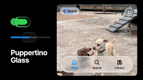
Puppertino Glass: How we implemented liquid glass for UI components and surfaces
Apple's Liquid Glass has no native version on the web. Puppertino ships two: a faux lens for switches and sliders that works everywhere with no library, and real-time refraction for bars, buttons and panels in Safari, Chrome, Firefox and Edge. Here is how each one is built and when to use which.
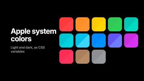
Apple system colors in CSS, with the hex values
The thirteen macOS 27 and iOS 27 accents, the text levels, fills, backgrounds, grays and separators, as hex and rgba for light and dark, and as CSS custom properties that flip on their own. Copy the table or load the stylesheet.
How to get an AI agent to design like Apple on the web
Claude Code, Codex and Cursor can build macOS and iOS style interfaces on the web that follow Apple's Human Interface Guidelines. The Puppertino skill gives them the rules and the markup, in one install.